Our Three Step Process
Complete Product Range Design – One Brand, Multiple Products
Our Three Step Process
Complete Product Range Design – One Brand, Multiple Products
A curated collection of full product range packaging + label systems, built for consistency across SKUs, clear variant differentiation, and premium shelf presence across multiple industries.
Task: Product Range Packaging & Label Design (multi-SKU systems) | Project Type: Packaging & Labeling • Brand Identity • Range Design (Illustrator + Photoshop) |
Overview
In product categories with many competitors and similar claims, packaging has to do two jobs fast: build trust and make the right variant easy to choose. This collection showcases full product range work, where every SKU feels consistent as one brand, while still staying clearly different by flavor/type/benefit.
Focus: Range consistency • Variant differentiation • Label clarity • Shelf impact
Objective | Target Users | Deliverable |
|---|---|---|
Create scalable packaging systems that look premium and consistent across a full range, while keeping each variant instantly recognizable. | Brand owners and shoppers who need quick clarity on what it is, what it does, and which variant to pick at a glance. | Full range packaging and label designs across multiple formats (bottles, jars, pouches, tubs), with a consistent brand system and clear variant architecture. |
Challenge
Range design isn’t about one label, it’s about a system.
Every SKU must feel like the same brand, but never feel “copied.”
The challenge is balancing strong shelf presence with clean hierarchy: keeping key info readable, ensuring variants don’t confuse each other, and maintaining consistency across different packaging shapes and sizes.
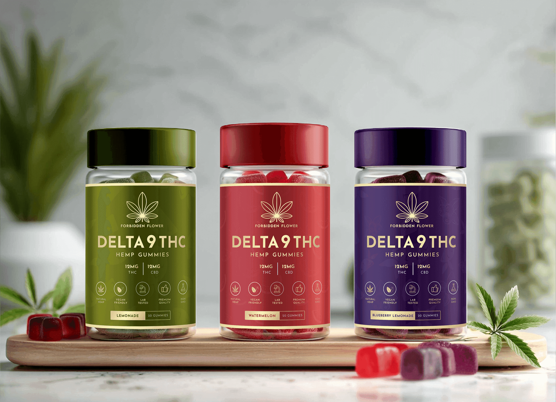
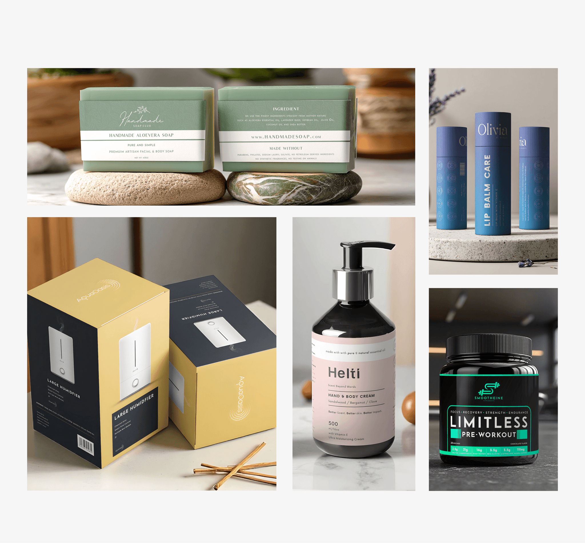
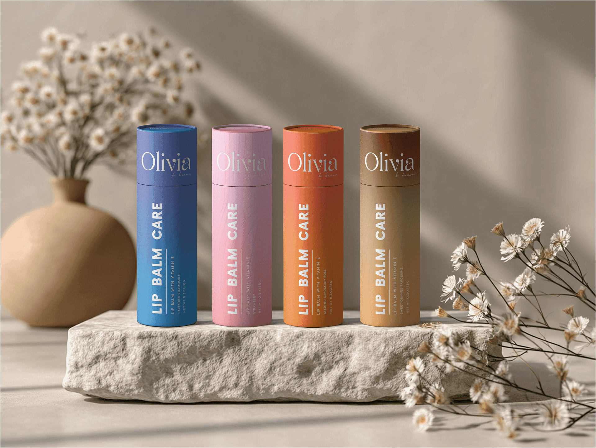
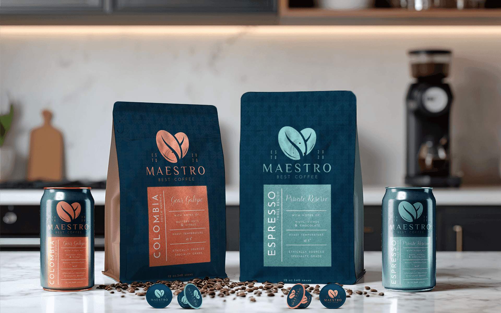
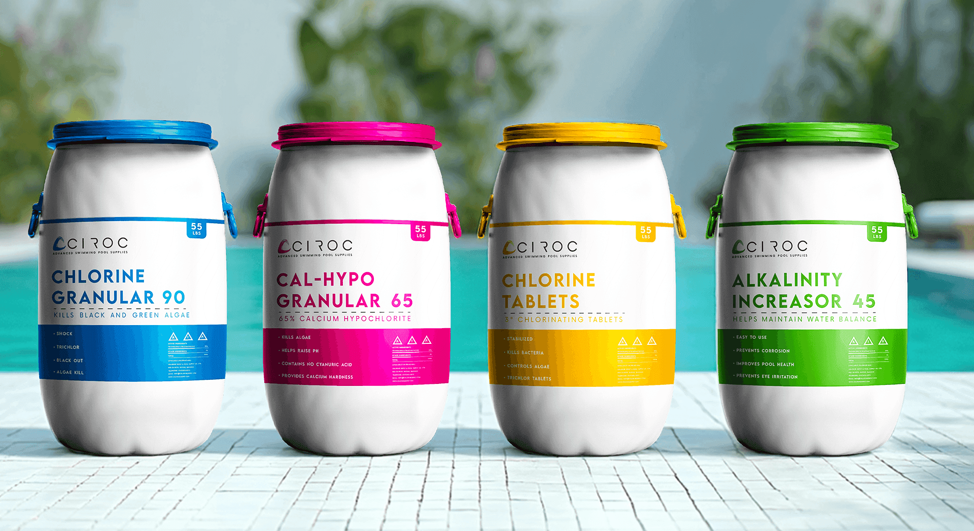
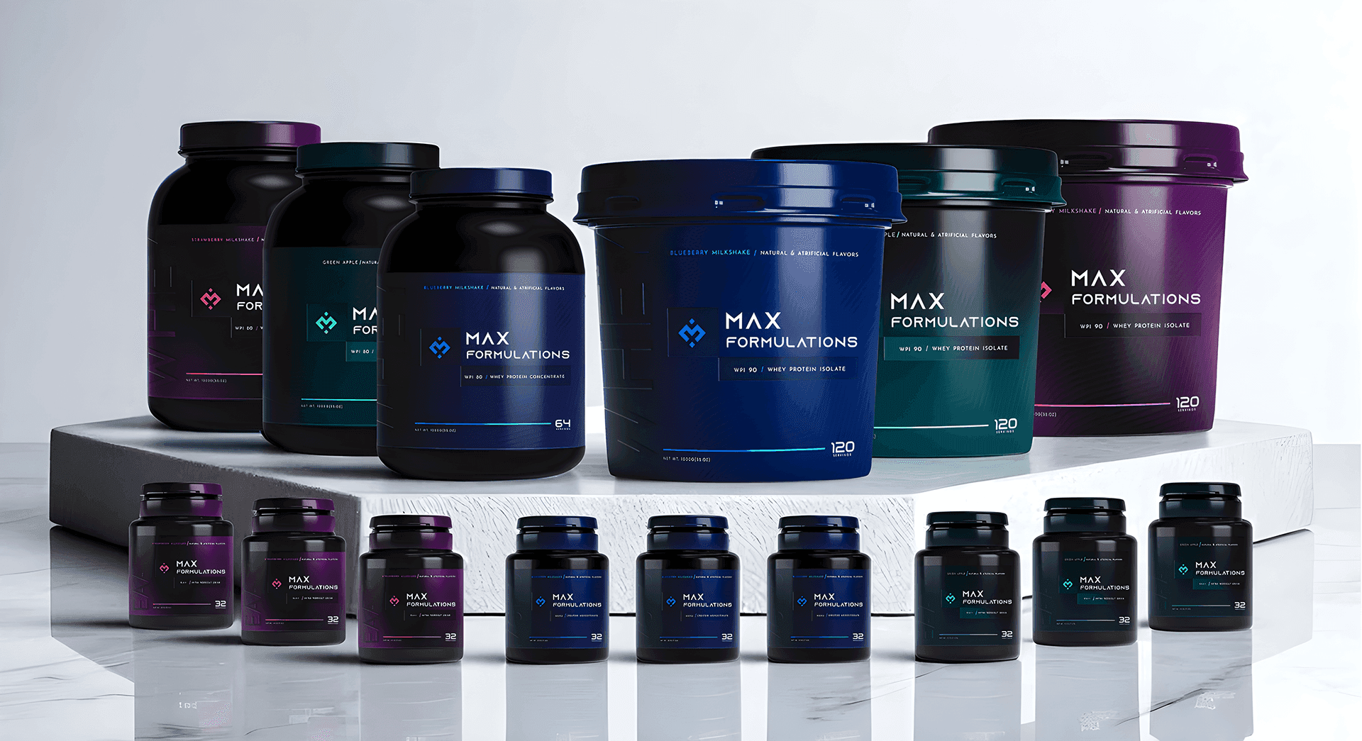
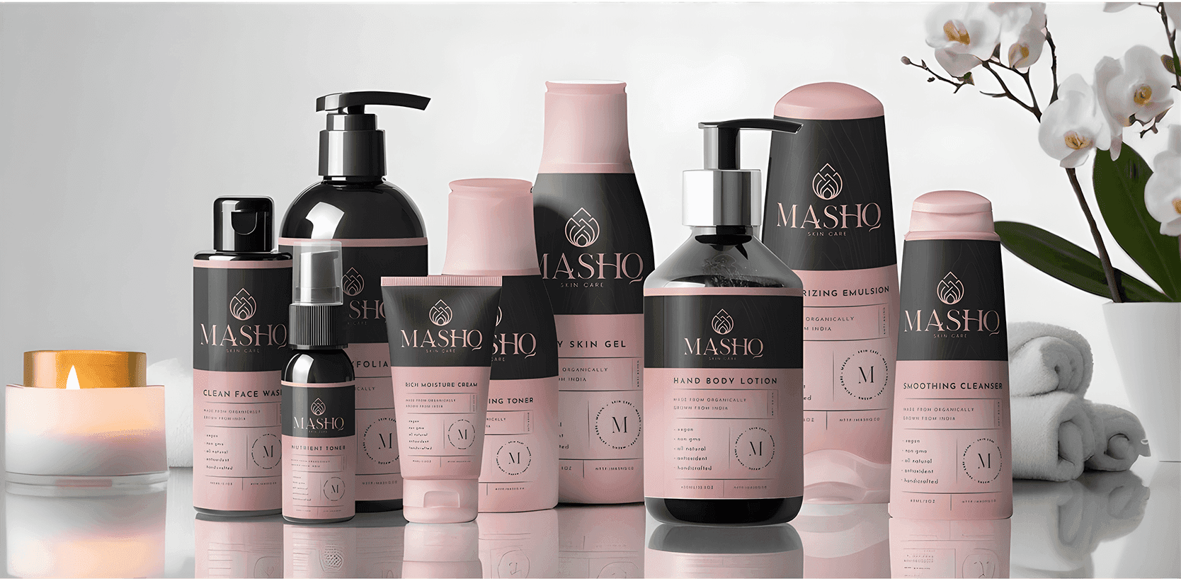
Key Product Range Screens
A selection of full product range mockups designed to keep the experience premium, consistent, and easy to navigate across multiple SKUs.
Where Shelf Decisions Happen
Most decisions happen in the first few seconds—when customers ask:
What is this product?
Which variant is right for me?
Can I trust this brand?
What’s the key benefit / difference?
The system answers these through clear hierarchy, bold variant cues (color + naming), and structured information blocks, so shoppers choose faster, with confidence.
Solution
We designed product range systems that scale: a consistent brand foundation (logo, typography, layout rules) paired with clear variant differentiation, so the shelf looks organized, premium, and easy to shop.
Design Process
What We Focused On
• System first (define layout rules that scale across SKUs)
• Variant architecture (color + naming logic that stays consistent)
• Clarity & hierarchy (what matters first, visible at a glance)
• Range realism (mockups across formats to validate shelf presence)
Range Design Formula: System → Variants → Clarity → Shelf Impact
Want to explore the complete product range
collection?
Click Link Below to view the complete case study.
Task: Product Range Packaging & Label Design (multi-SKU systems) | Project Type: Packaging & Labeling • Brand Identity • Range Design (Illustrator + Photoshop) |
Overview
In product categories with many competitors and similar claims, packaging has to do two jobs fast: build trust and make the right variant easy to choose. This collection showcases full product range work, where every SKU feels consistent as one brand, while still staying clearly different by flavor/type/benefit.
Focus: Range consistency • Variant differentiation • Label clarity • Shelf impact
Objective | Target Users | Deliverable |
|---|---|---|
Create scalable packaging systems that look premium and consistent across a full range, while keeping each variant instantly recognizable. | Brand owners and shoppers who need quick clarity on what it is, what it does, and which variant to pick at a glance. | Full range packaging and label designs across multiple formats (bottles, jars, pouches, tubs), with a consistent brand system and clear variant architecture. |
Challenge
Range design isn’t about one label, it’s about a system.
Every SKU must feel like the same brand, but never feel “copied.”
The challenge is balancing strong shelf presence with clean hierarchy: keeping key info readable, ensuring variants don’t confuse each other, and maintaining consistency across different packaging shapes and sizes.
Key Product Range Screens
A selection of full product range mockups designed to keep the experience premium, consistent, and easy to navigate across multiple SKUs.
Where Shelf Decisions Happen
Most decisions happen in the first few seconds—when customers ask:
What is this product?
Which variant is right for me?
Can I trust this brand?
What’s the key benefit / difference?
The system answers these through clear hierarchy, bold variant cues (color + naming), and structured information blocks, so shoppers choose faster, with confidence.
Solution
We designed product range systems that scale: a consistent brand foundation (logo, typography, layout rules) paired with clear variant differentiation, so the shelf looks organized, premium, and easy to shop.
Design Process
What We Focused On
• System first (define layout rules that scale across SKUs)
• Variant architecture (color + naming logic that stays consistent)
• Clarity & hierarchy (what matters first, visible at a glance)
• Range realism (mockups across formats to validate shelf presence)
Range Design Formula: System → Variants → Clarity → Shelf Impact
Want to explore the complete product range
collection?
Click Link Below to view the complete case study.
A curated collection of full product range packaging + label systems, built for consistency across SKUs, clear variant differentiation, and premium shelf presence across multiple industries.
Task: Product Range Packaging & Label Design (multi-SKU systems) | Project Type: Packaging & Labeling • Brand Identity • Range Design (Illustrator + Photoshop) |
Overview
In product categories with many competitors and similar claims, packaging has to do two jobs fast: build trust and make the right variant easy to choose. This collection showcases full product range work, where every SKU feels consistent as one brand, while still staying clearly different by flavor/type/benefit.
Focus: Range consistency • Variant differentiation • Label clarity • Shelf impact
Objective | Target Users | Deliverable |
|---|---|---|
Create scalable packaging systems that look premium and consistent across a full range, while keeping each variant instantly recognizable. | Brand owners and shoppers who need quick clarity on what it is, what it does, and which variant to pick at a glance. | Full range packaging and label designs across multiple formats (bottles, jars, pouches, tubs), with a consistent brand system and clear variant architecture. |
Challenge
Range design isn’t about one label, it’s about a system.
Every SKU must feel like the same brand, but never feel “copied.”
The challenge is balancing strong shelf presence with clean hierarchy: keeping key info readable, ensuring variants don’t confuse each other, and maintaining consistency across different packaging shapes and sizes.
Key Product Range Screens
A selection of full product range mockups designed to keep the experience premium, consistent, and easy to navigate across multiple SKUs.
Where Shelf Decisions Happen
Most decisions happen in the first few seconds—when customers ask:
What is this product?
Which variant is right for me?
Can I trust this brand?
What’s the key benefit / difference?
The system answers these through clear hierarchy, bold variant cues (color + naming), and structured information blocks, so shoppers choose faster, with confidence.
Solution
We designed product range systems that scale: a consistent brand foundation (logo, typography, layout rules) paired with clear variant differentiation, so the shelf looks organized, premium, and easy to shop.
Design Process
What We Focused On
• System first (define layout rules that scale across SKUs)
• Variant architecture (color + naming logic that stays consistent)
• Clarity & hierarchy (what matters first, visible at a glance)
• Range realism (mockups across formats to validate shelf presence)
Range Design Formula: System → Variants → Clarity → Shelf Impact
Want to explore the complete product range
collection?
Click Link Below to view the complete case study.


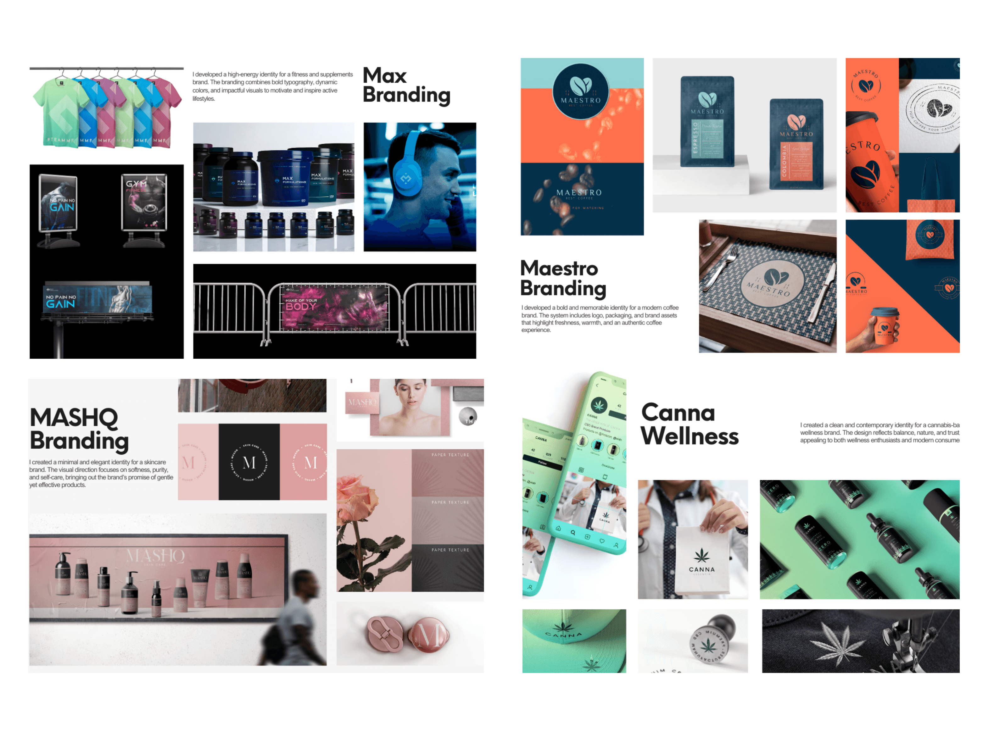
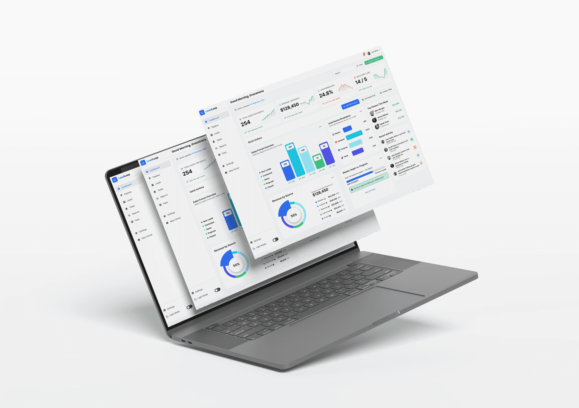
Other Projects
Other Case Studies
Check our other project case studies with detailed explanations

Other Projects
Other Case Studies
Check our other project case studies with detailed explanations