Our Three Step Process
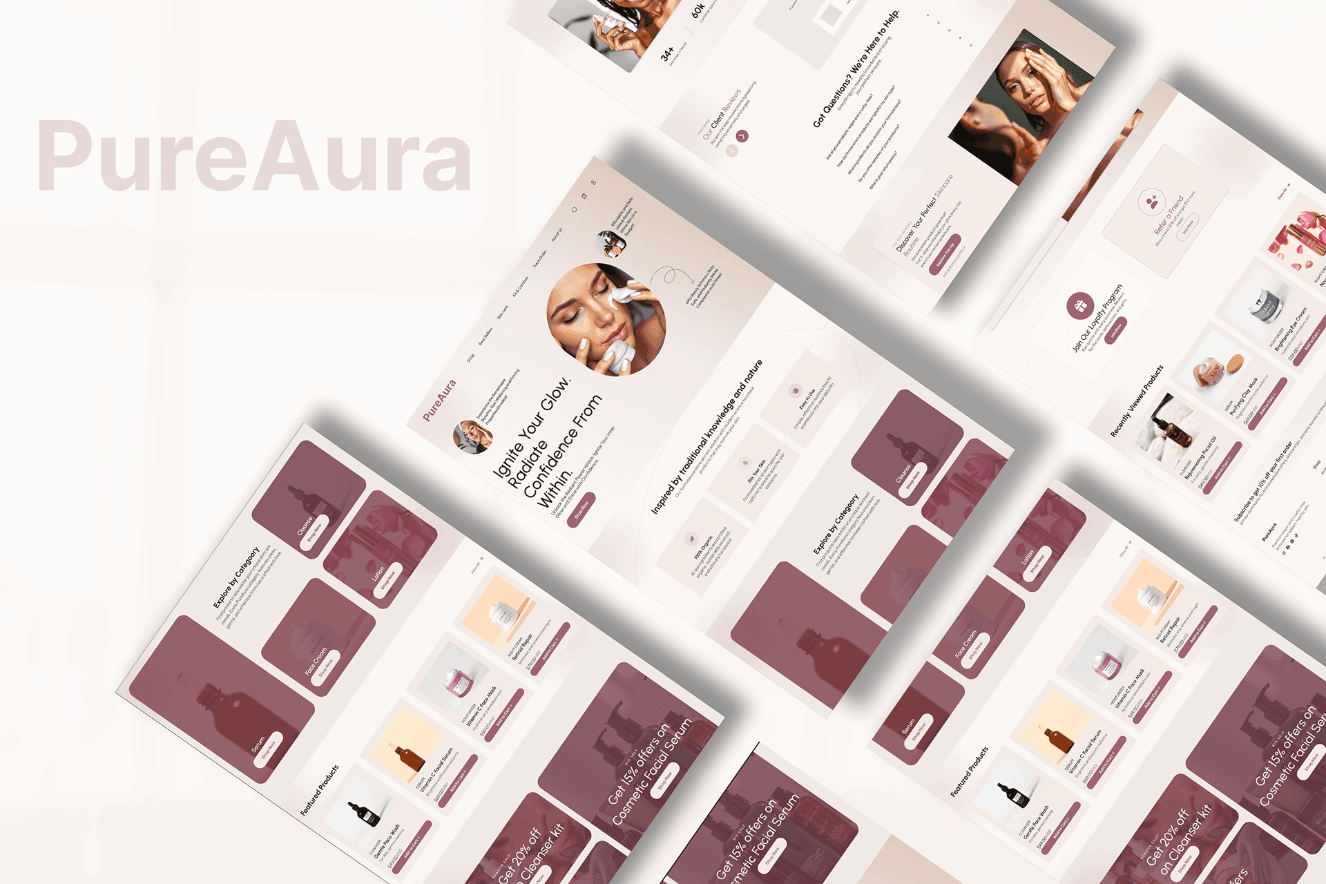
Pure Aura - Skincare E-Commerce Website UI/UX
Our Three Step Process
Pure Aura - Skincare E-Commerce Website UI/UX
A calm, premium E-commerce website designed for a modern skincare brand, focused on trust and ingredient clarity, guiding users from discovery to checkout with confidence.
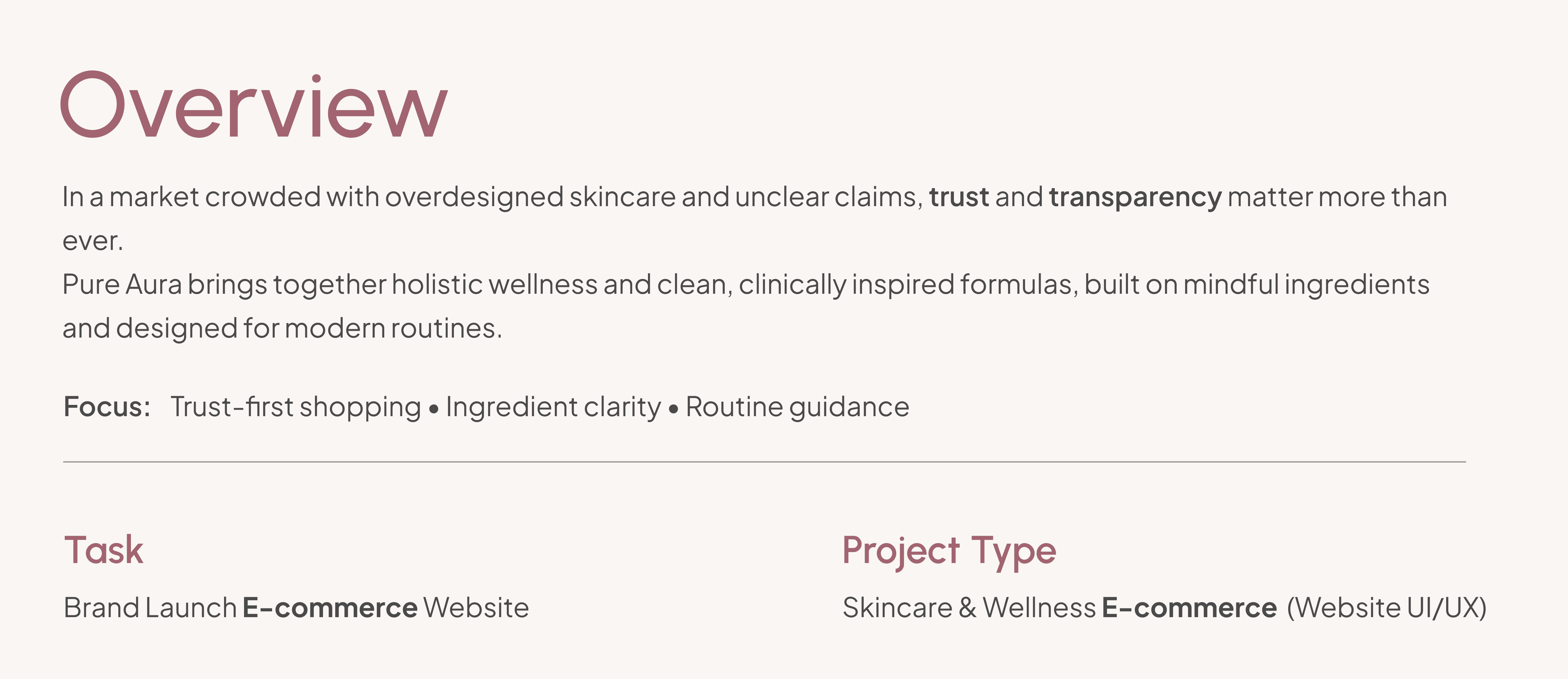
Objective: | Target Users: | Deliverable: |
Create a premium e-commerce website that feels calm, credible, and easy to shop. | Skincare shoppers who care about ingredients, results, and routine clarity. | Key pages designed: Homepage, Product Page, About, Category/Collection, Support. |
Challenge
Skincare users don’t buy instantly, they evaluate.
So the experience must build trust before pushing purchase.
To reduce hesitation, the experience needed to communicate what the product does, why it’s trustworthy, and how to use it, without feeling cluttered or overly salesy.

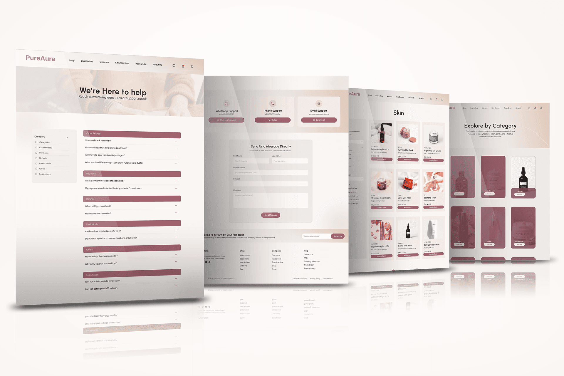
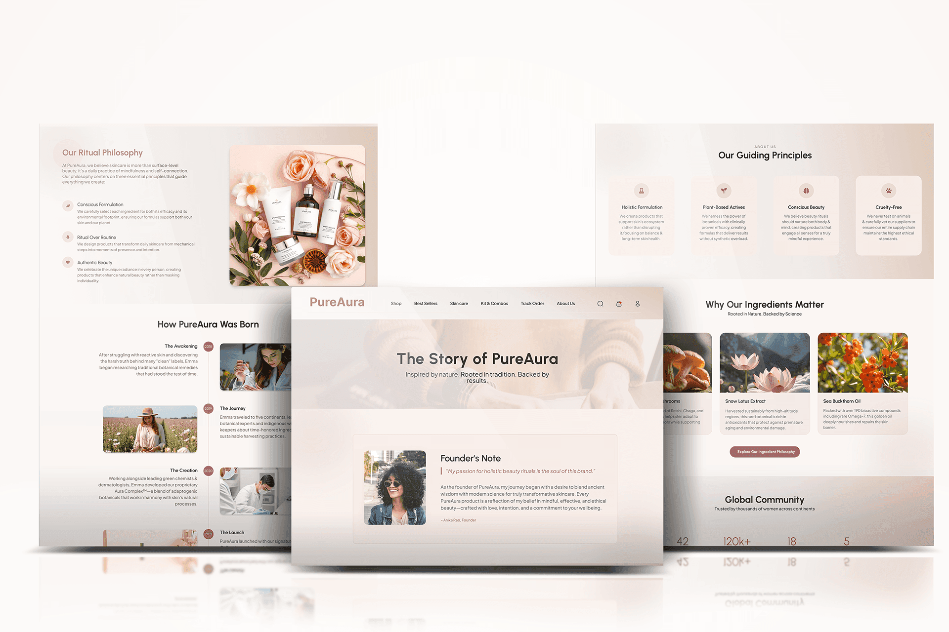
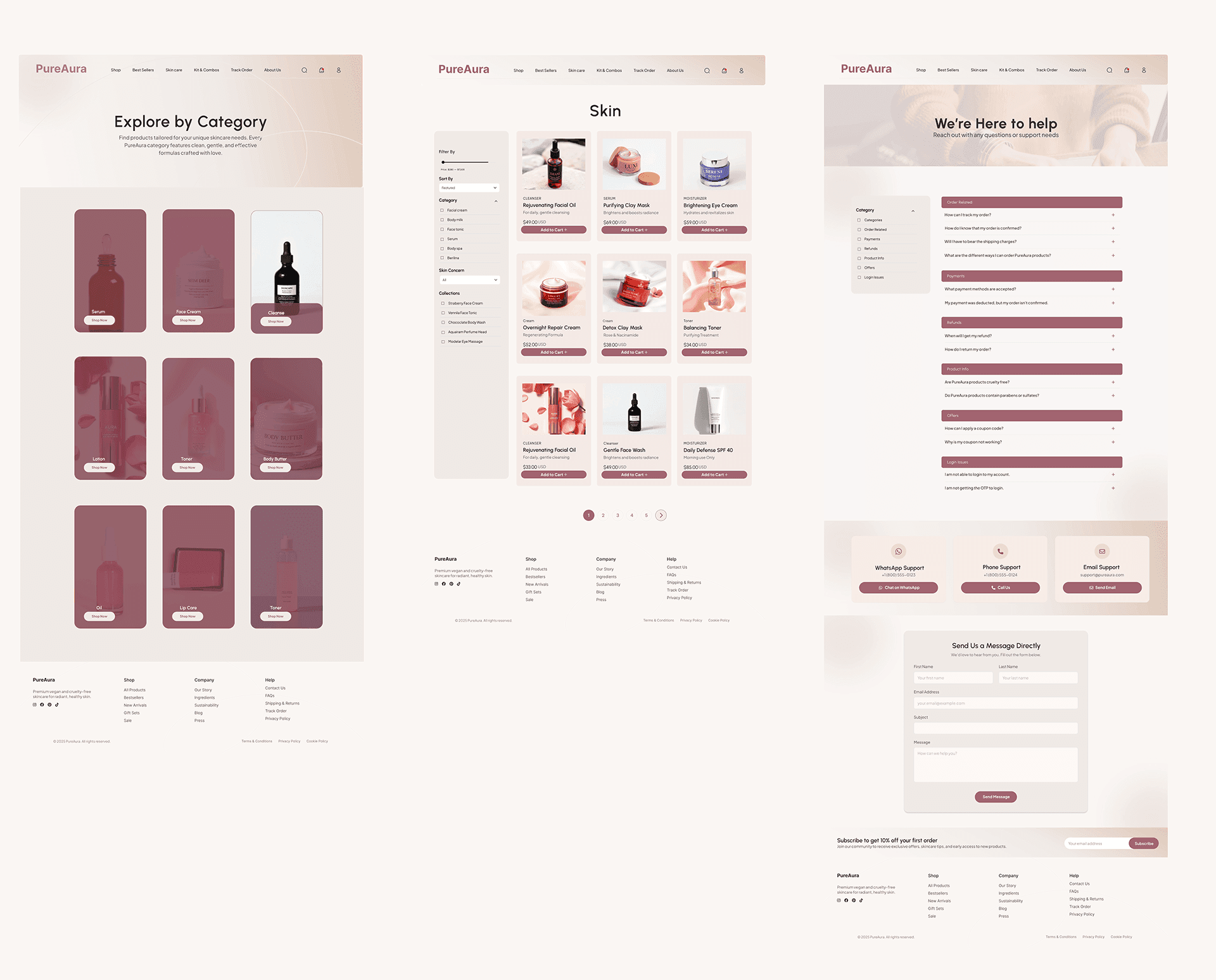
Key Website Screens
A set of core screens designed for discovery and evaluation, keeping the experience soft, minimal, and premium from first click to product decision.
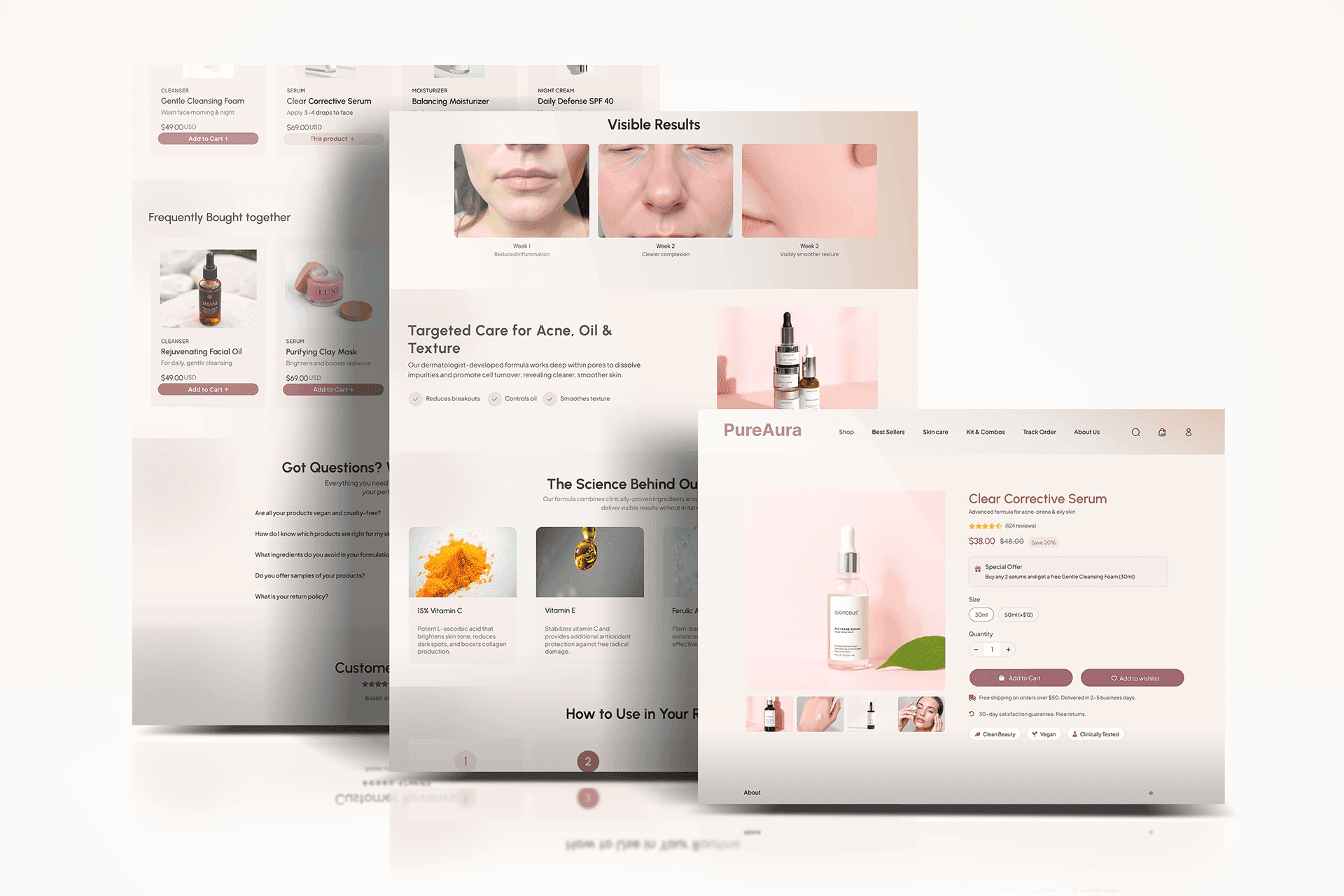
Where Skincare Decisions Happen
Most decisions happen on the product page when users ask:
Is this right for my skin?
What’s inside?
How do I use it?
Can I trust it?
The layout answers these fast through benefits, formula/ingredient clarity, routine steps, and reviews + FAQs.
Solution
We designed a calm, conversion-ready experience that balances brand story with E-commerce usability. The UI prioritizes clean hierarchy, scannable content blocks, and trust cues, so users can browse peacefully and buy with confidence.
Design Process
What We Focused On
• Trust-first layout (calm spacing, credibility blocks, clear hierarchy)
• Faster discovery (categories + curated product sections)
• Decision confidence on PDP (scannable layout, trust cues, reviews + FAQs)
• Consistency across pages (repeatable blocks and UI patterns)
Pure Aura UX Formula: Benefits → Ingredients → Routine → Proof
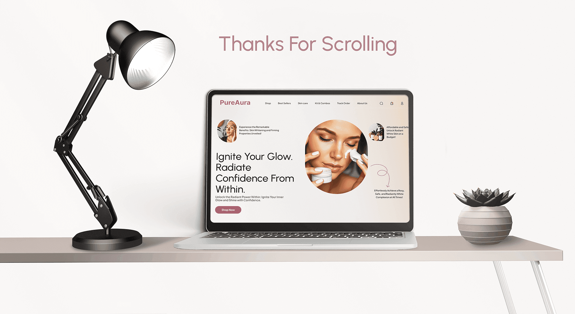
Want to see the full journey and explore more
pages?
Click Link Below to view the complete case study.
Objective: | Target Users: | Deliverable: |
Create a premium e-commerce website that feels calm, credible, and easy to shop. | Skincare shoppers who care about ingredients, results, and routine clarity. | Key pages designed: Homepage, Product Page, About, Category/Collection, Support. |
Challenge
Skincare users don’t buy instantly, they evaluate.
So the experience must build trust before pushing purchase.
To reduce hesitation, the experience needed to communicate what the product does, why it’s trustworthy, and how to use it, without feeling cluttered or overly salesy.
Key Website Screens
A set of core screens designed for discovery and evaluation, keeping the experience soft, minimal, and premium from first click to product decision.
Where Skincare Decisions Happen
Most decisions happen on the product page when users ask:
Is this right for my skin?
What’s inside?
How do I use it?
Can I trust it?
The layout answers these fast through benefits, formula/ingredient clarity, routine steps, and reviews + FAQs.
Solution
We designed a calm, conversion-ready experience that balances brand story with E-commerce usability. The UI prioritizes clean hierarchy, scannable content blocks, and trust cues, so users can browse peacefully and buy with confidence.
Design Process
What We Focused On
• Trust-first layout (calm spacing, credibility blocks, clear hierarchy)
• Faster discovery (categories + curated product sections)
• Decision confidence on PDP (scannable layout, trust cues, reviews + FAQs)
• Consistency across pages (repeatable blocks and UI patterns)
Pure Aura UX Formula: Benefits → Ingredients → Routine → Proof
Want to see the full journey and explore more
pages?
Click Link Below to view the complete case study.
A calm, premium E-commerce website designed for a modern skincare brand, focused on trust and ingredient clarity, guiding users from discovery to checkout with confidence.
Objective: | Target Users: | Deliverable: |
Create a premium e-commerce website that feels calm, credible, and easy to shop. | Skincare shoppers who care about ingredients, results, and routine clarity. | Key pages designed: Homepage, Product Page, About, Category/Collection, Support. |
Challenge
Skincare users don’t buy instantly, they evaluate.
So the experience must build trust before pushing purchase.
To reduce hesitation, the experience needed to communicate what the product does, why it’s trustworthy, and how to use it, without feeling cluttered or overly salesy.
Key Website Screens
A set of core screens designed for discovery and evaluation, keeping the experience soft, minimal, and premium from first click to product decision.
Where Skincare Decisions Happen
Most decisions happen on the product page when users ask:
Is this right for my skin?
What’s inside?
How do I use it?
Can I trust it?
The layout answers these fast through benefits, formula/ingredient clarity, routine steps, and reviews + FAQs.
Solution
We designed a calm, conversion-ready experience that balances brand story with E-commerce usability. The UI prioritizes clean hierarchy, scannable content blocks, and trust cues, so users can browse peacefully and buy with confidence.
Design Process
What We Focused On
• Trust-first layout (calm spacing, credibility blocks, clear hierarchy)
• Faster discovery (categories + curated product sections)
• Decision confidence on PDP (scannable layout, trust cues, reviews + FAQs)
• Consistency across pages (repeatable blocks and UI patterns)
Pure Aura UX Formula: Benefits → Ingredients → Routine → Proof
Want to see the full journey and explore more
pages?
Click Link Below to view the complete case study.
Other Projects
Other Case Studies
Check our other project case studies with detailed explanations


Other Projects
Other Case Studies
Check our other project case studies with detailed explanations