Our Three Step Process
MAESTRO- Coffee Brand Identity & Packaging

Our Three Step Process
MAESTRO- Coffee Brand Identity & Packaging
MAESTRO is a premium coffee brand identity designed to express craftsmanship, heritage, and quality. The project focused on building a bold yet refined visual system, supported by distinctive packaging that stands out on shelves while maintaining a timeless, artisanal feel.
MAESTRO is a premium coffee brand identity built to feel crafted, confident, and shelf-ready. The goal was to create a cohesive visual system that scales across packaging, café touchpoints, and marketing without losing its premium feel.
The Business Challenge
MAESTRO needed a brand presence that could stand out in a crowded specialty coffee category while staying timeless. The main challenge was building a system that looks consistent across multiple products and surfaces, not just a logo.
Different SKUs needed clear differentiation
Packaging needed strong shelf impact
The identity had to stay premium across every touchpoint
Brand Strategy & Direction
We positioned MAESTRO as heritage-meets-modern: clean structure, warm craft cues, and a confident premium tone. The system was designed around repeatable rules - so every new SKU and layout still feels unmistakably MAESTRO.
• Strong core mark + flexible lockups
• Pattern + color system for recognition
• A packaging hierarchy that stays consistent
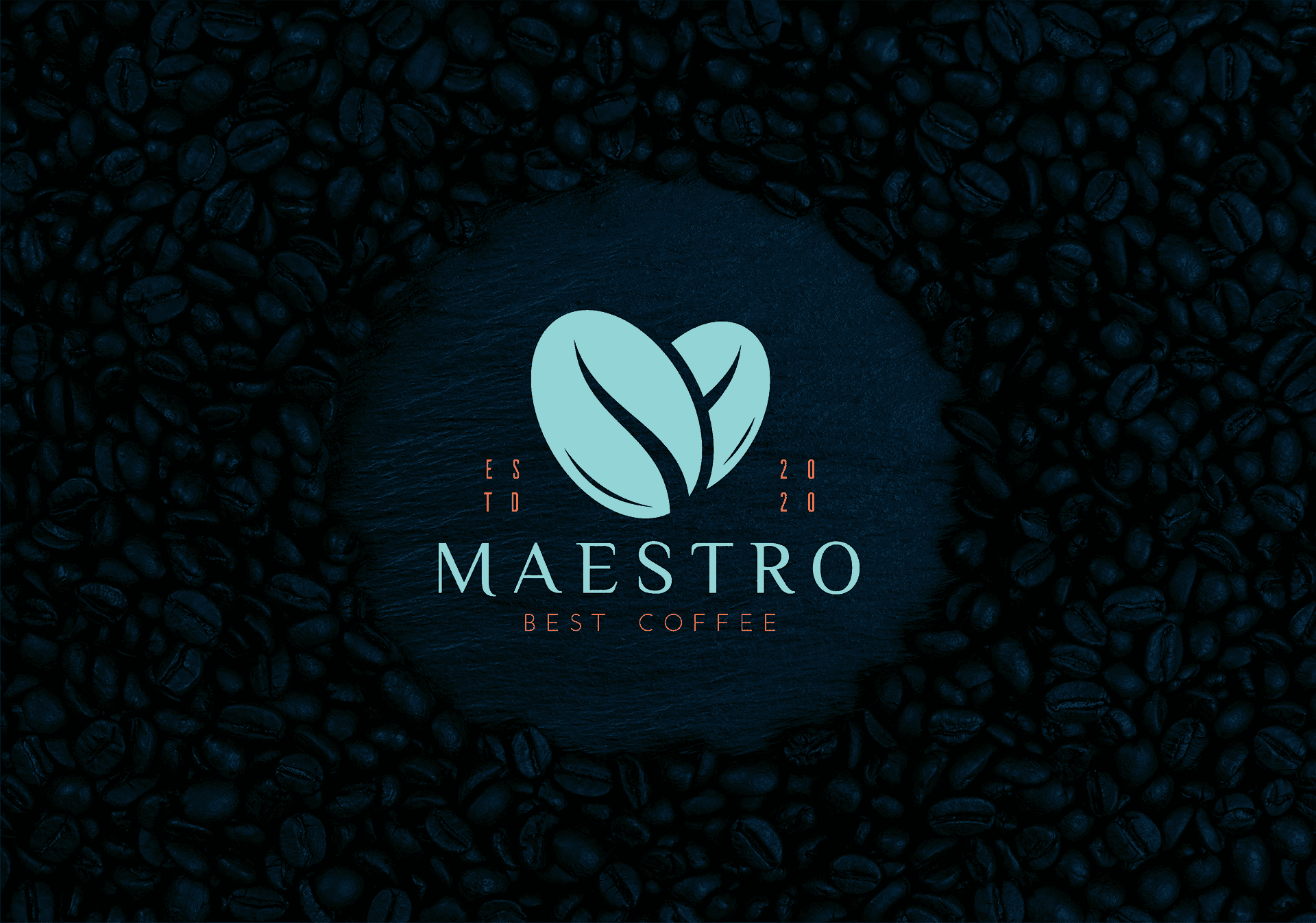
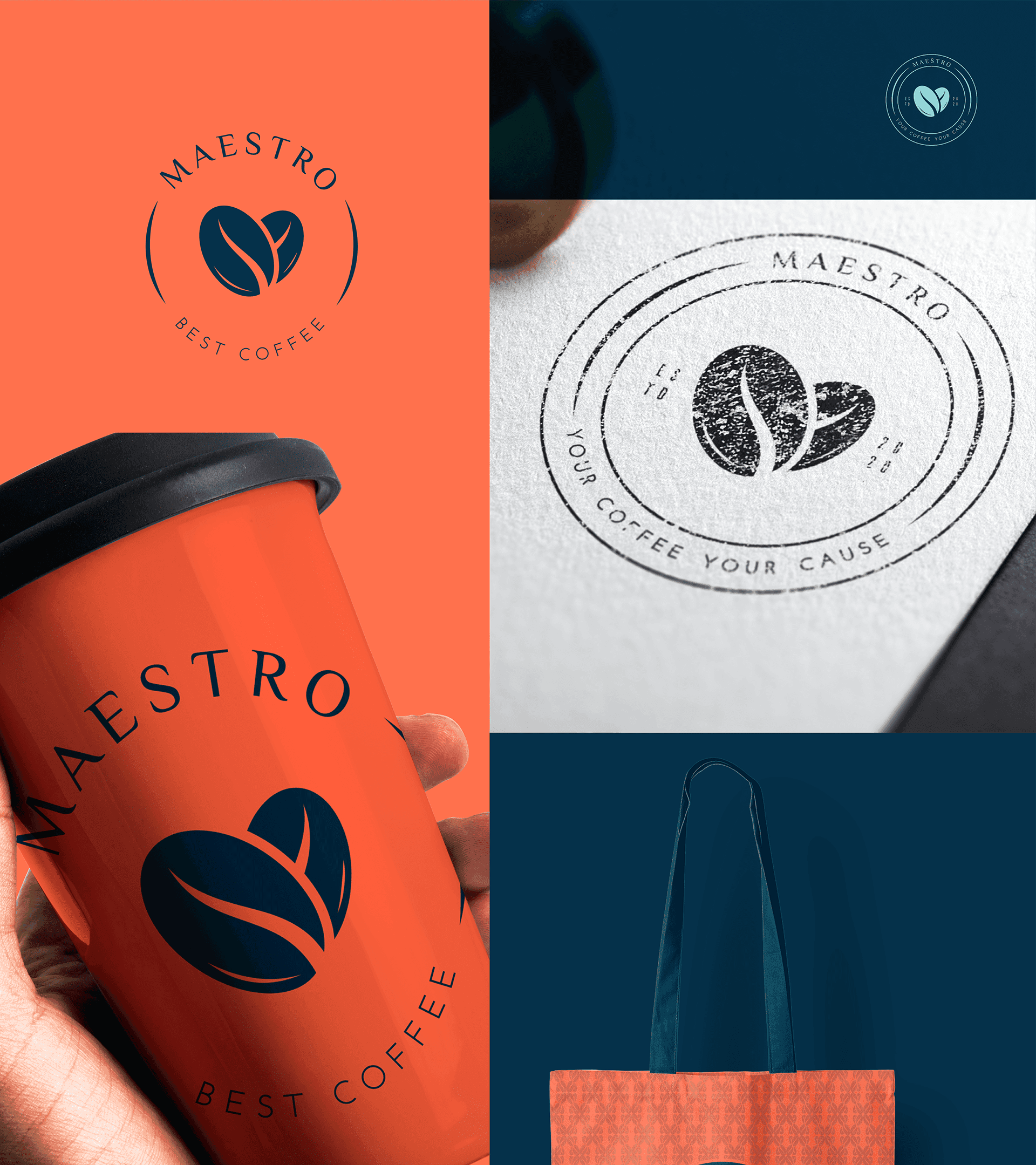
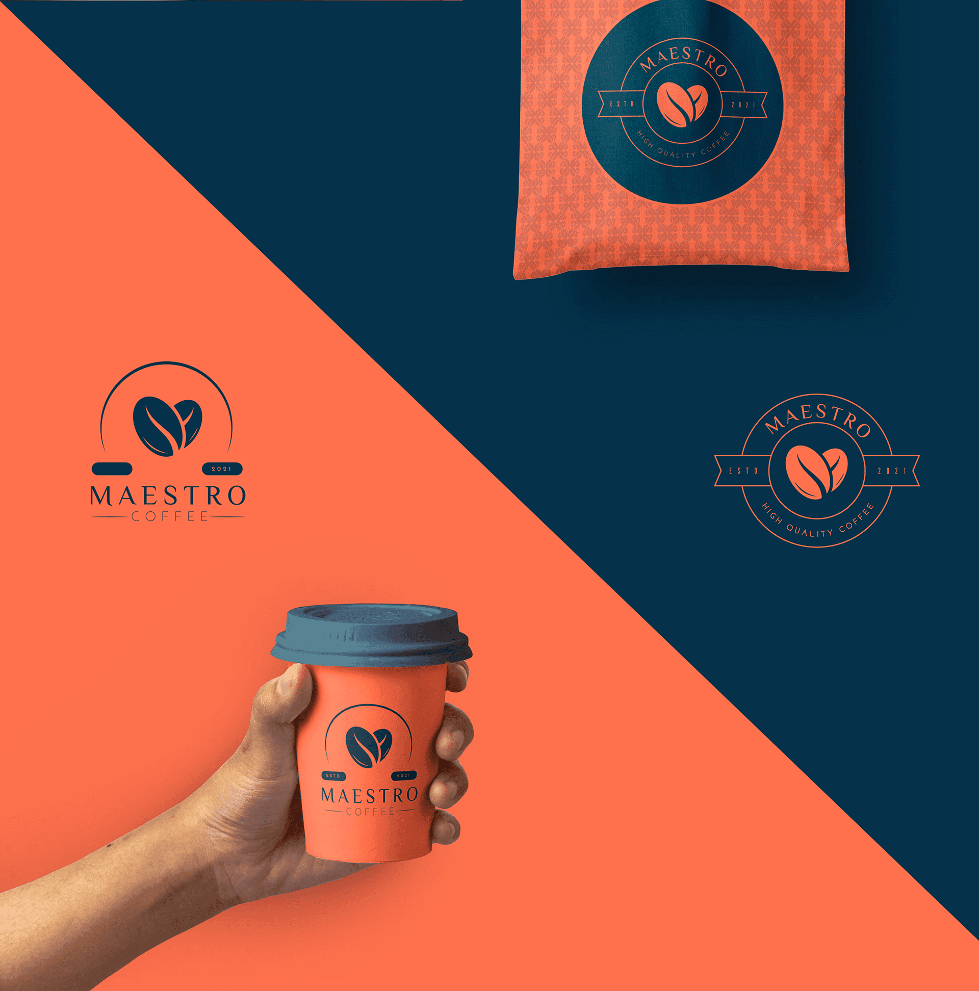
Logo & Wordmark System
The identity centers around a mark that feels crafted, iconic, and memorable, with a wordmark that stays premium across print, packaging, and digital. The goal was to keep it minimal, recognizable at small sizes, and strong on dark backgrounds.
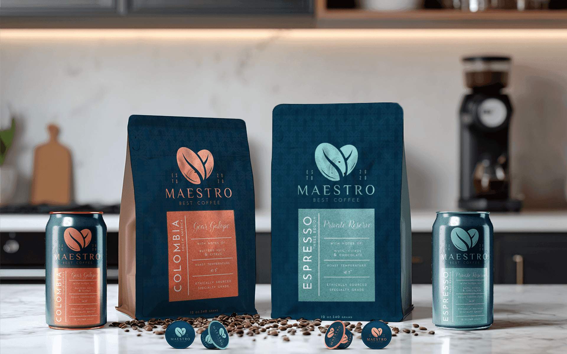
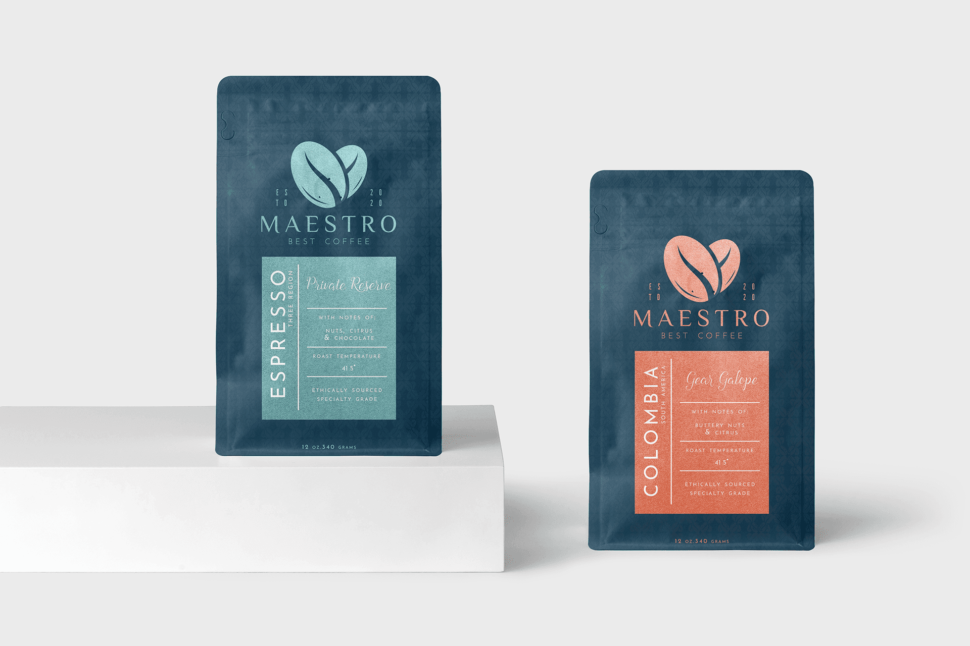
Packaging System (SKU Architecture)
The packaging was built as a modular system, a repeatable structure that keeps the brand consistent while allowing each product variant to have its own personality. This makes the lineup feel premium, organized, and scalable.
• Easy SKU expansion without redesigning everything
• Clear reading from distance (shelf + ecommerce)
Consistent hierarchy (brand → variant → details)
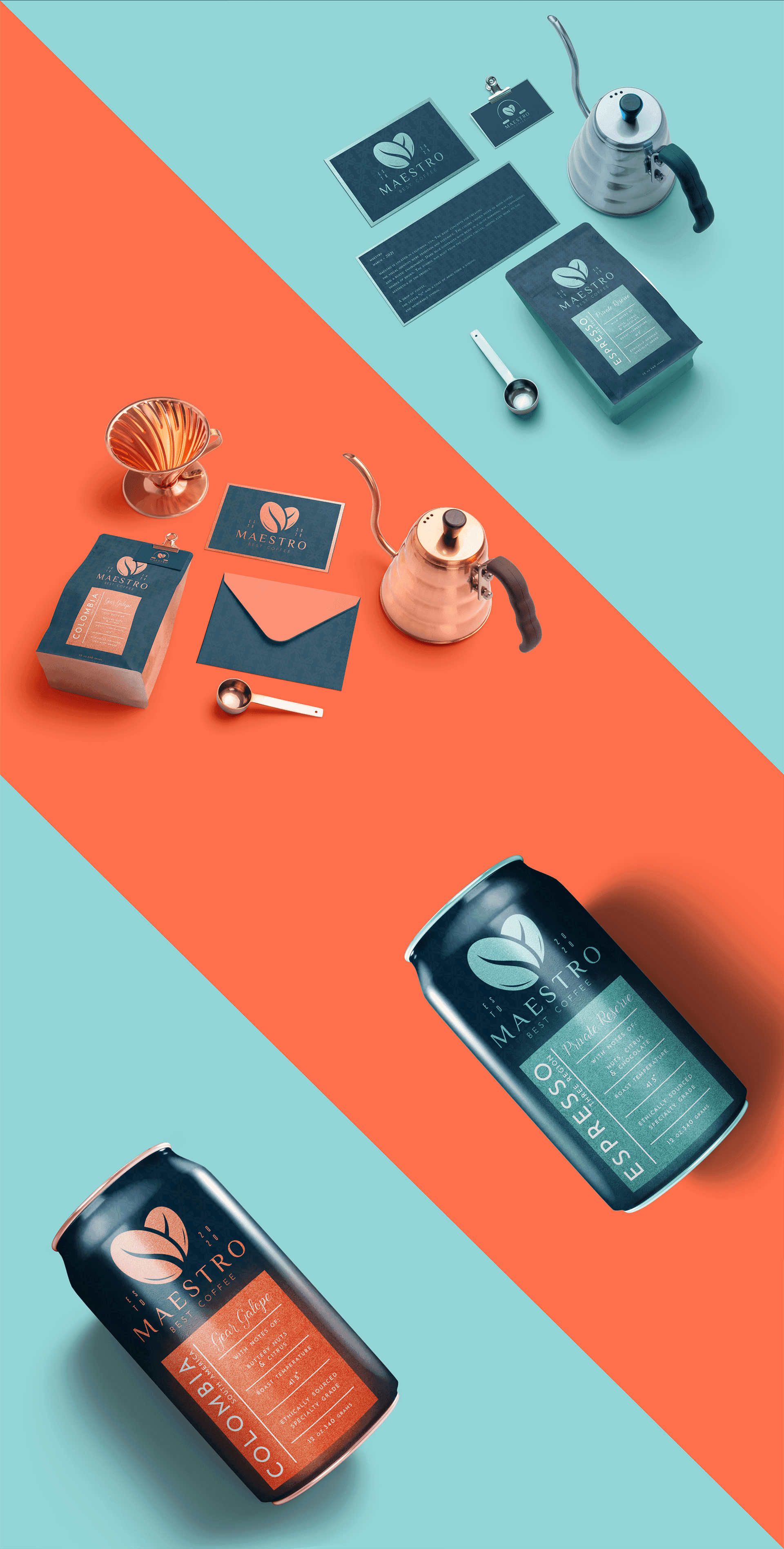
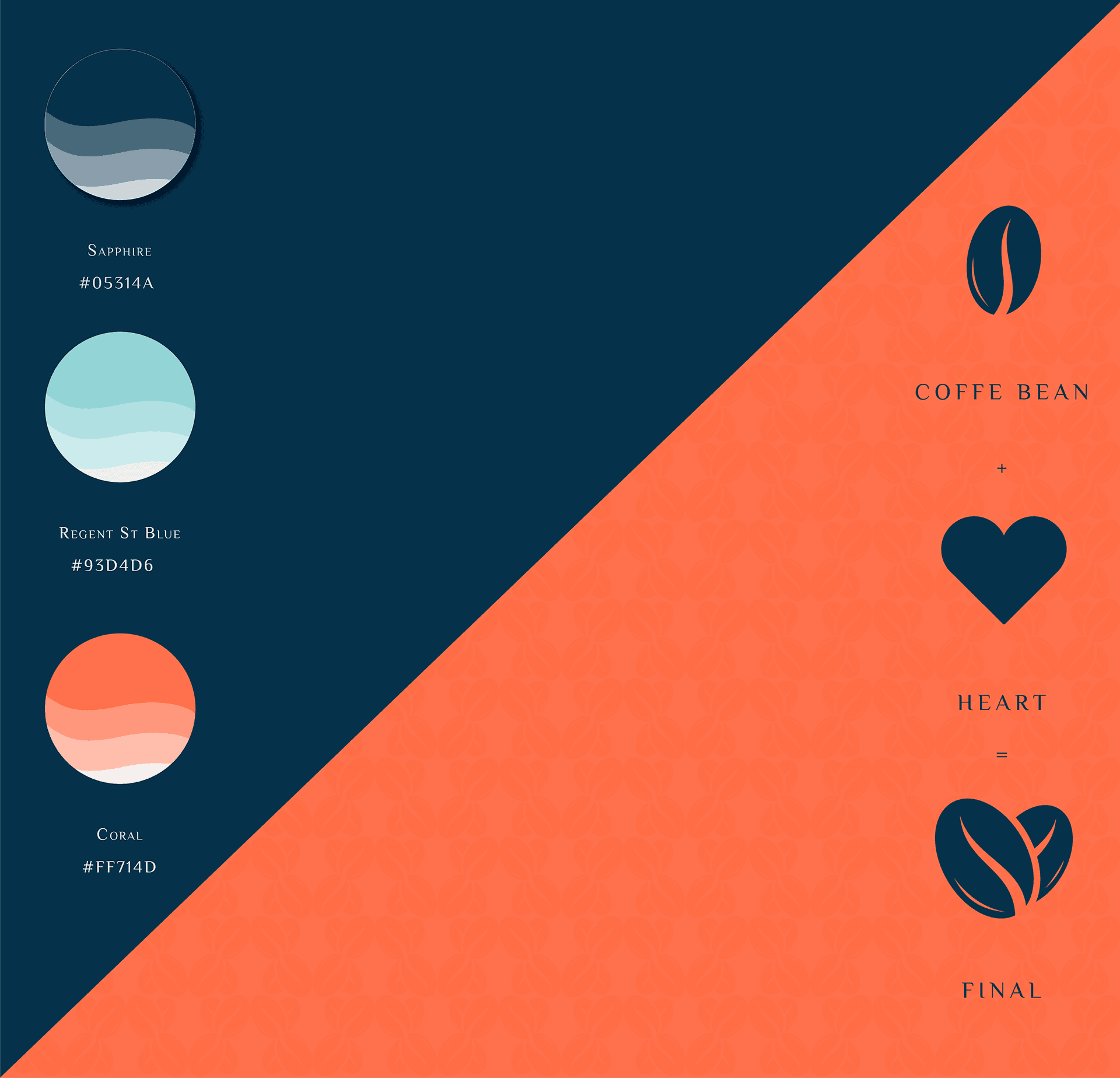
Visual Identity Elements (Color + Pattern)
To strengthen recognition and brand recall, we introduced a pattern + color system that supports the packaging and extends naturally into brand collateral. These elements keep the identity consistent while adding energy in marketing applications.
• Repeatable brand pattern for fast recognition
• Color system that supports SKU differentiation
• Premium textures + rhythm without clutter
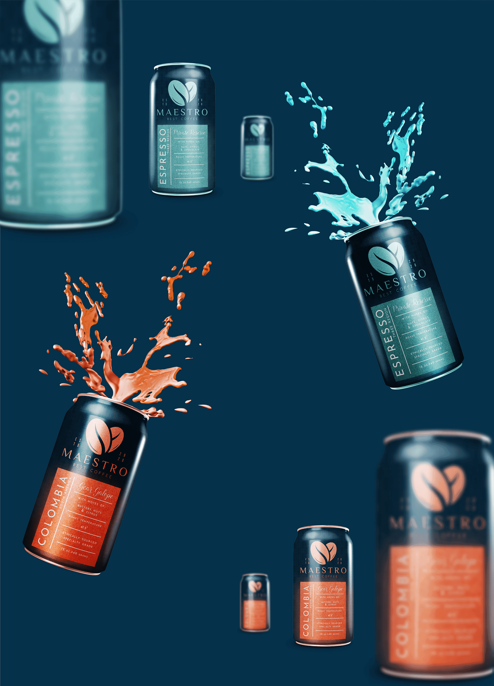
Product Visuals & Campaign Energy
For marketing moments, we created visuals that feel bold and modern, adding energy without losing the premium tone. This helps the brand look strong on social, ads, and launches.
• Strong contrast and brand recall
• Product-first compositions
• Premium + dynamic visual language
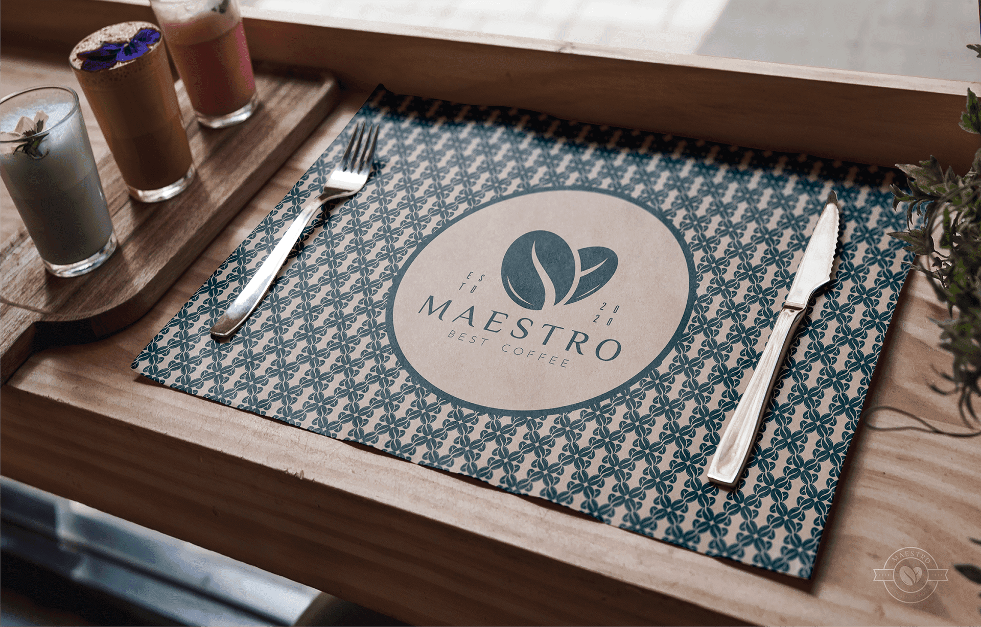
In-Context Brand Experience
The identity was designed to work where decisions happen: in cafés, in-hand, and in real environments. That’s what makes the system feel trustworthy, premium, and purchase-ready.
Want to see the full journey and explore more
pages?
Click Link Below to view the complete case study.

MAESTRO is a premium coffee brand identity built to feel crafted, confident, and shelf-ready. The goal was to create a cohesive visual system that scales across packaging, café touchpoints, and marketing without losing its premium feel.
The Business Challenge
MAESTRO needed a brand presence that could stand out in a crowded specialty coffee category while staying timeless. The main challenge was building a system that looks consistent across multiple products and surfaces, not just a logo.
Different SKUs needed clear differentiation
Packaging needed strong shelf impact
The identity had to stay premium across every touchpoint
Brand Strategy & Direction
We positioned MAESTRO as heritage-meets-modern: clean structure, warm craft cues, and a confident premium tone. The system was designed around repeatable rules - so every new SKU and layout still feels unmistakably MAESTRO.
• Strong core mark + flexible lockups
• Pattern + color system for recognition
• A packaging hierarchy that stays consistent
Logo & Wordmark System
The identity centers around a mark that feels crafted, iconic, and memorable, with a wordmark that stays premium across print, packaging, and digital. The goal was to keep it minimal, recognizable at small sizes, and strong on dark backgrounds.
Packaging System (SKU Architecture)
The packaging was built as a modular system, a repeatable structure that keeps the brand consistent while allowing each product variant to have its own personality. This makes the lineup feel premium, organized, and scalable.
• Easy SKU expansion without redesigning everything
• Clear reading from distance (shelf + ecommerce)
Consistent hierarchy (brand → variant → details)
Visual Identity Elements (Color + Pattern)
To strengthen recognition and brand recall, we introduced a pattern + color system that supports the packaging and extends naturally into brand collateral. These elements keep the identity consistent while adding energy in marketing applications.
• Repeatable brand pattern for fast recognition
• Color system that supports SKU differentiation
• Premium textures + rhythm without clutter
Product Visuals & Campaign Energy
For marketing moments, we created visuals that feel bold and modern, adding energy without losing the premium tone. This helps the brand look strong on social, ads, and launches.
• Strong contrast and brand recall
• Product-first compositions
• Premium + dynamic visual language
In-Context Brand Experience
The identity was designed to work where decisions happen: in cafés, in-hand, and in real environments. That’s what makes the system feel trustworthy, premium, and purchase-ready.
Want to see the full journey and explore more
pages?
Click Link Below to view the complete case study.
MAESTRO is a premium coffee brand identity designed to express craftsmanship, heritage, and quality. The project focused on building a bold yet refined visual system, supported by distinctive packaging that stands out on shelves while maintaining a timeless, artisanal feel.
MAESTRO is a premium coffee brand identity built to feel crafted, confident, and shelf-ready. The goal was to create a cohesive visual system that scales across packaging, café touchpoints, and marketing without losing its premium feel.
The Business Challenge
MAESTRO needed a brand presence that could stand out in a crowded specialty coffee category while staying timeless. The main challenge was building a system that looks consistent across multiple products and surfaces, not just a logo.
Different SKUs needed clear differentiation
Packaging needed strong shelf impact
The identity had to stay premium across every touchpoint
Brand Strategy & Direction
We positioned MAESTRO as heritage-meets-modern: clean structure, warm craft cues, and a confident premium tone. The system was designed around repeatable rules - so every new SKU and layout still feels unmistakably MAESTRO.
• Strong core mark + flexible lockups
• Pattern + color system for recognition
• A packaging hierarchy that stays consistent
Logo & Wordmark System
The identity centers around a mark that feels crafted, iconic, and memorable, with a wordmark that stays premium across print, packaging, and digital. The goal was to keep it minimal, recognizable at small sizes, and strong on dark backgrounds.
Packaging System (SKU Architecture)
The packaging was built as a modular system, a repeatable structure that keeps the brand consistent while allowing each product variant to have its own personality. This makes the lineup feel premium, organized, and scalable.
• Easy SKU expansion without redesigning everything
• Clear reading from distance (shelf + ecommerce)
Consistent hierarchy (brand → variant → details)
Visual Identity Elements (Color + Pattern)
To strengthen recognition and brand recall, we introduced a pattern + color system that supports the packaging and extends naturally into brand collateral. These elements keep the identity consistent while adding energy in marketing applications.
• Repeatable brand pattern for fast recognition
• Color system that supports SKU differentiation
• Premium textures + rhythm without clutter
Product Visuals & Campaign Energy
For marketing moments, we created visuals that feel bold and modern, adding energy without losing the premium tone. This helps the brand look strong on social, ads, and launches.
• Strong contrast and brand recall
• Product-first compositions
• Premium + dynamic visual language
In-Context Brand Experience
The identity was designed to work where decisions happen: in cafés, in-hand, and in real environments. That’s what makes the system feel trustworthy, premium, and purchase-ready.
Want to see the full journey and explore more
pages?
Click Link Below to view the complete case study.
Other Projects
Other Case Studies
Check our other project case studies with detailed explanations

Other Projects
Other Case Studies
Check our other project case studies with detailed explanations